 service@loodon.com
 269-366-5323

Design Trend: One Color Logo Design
Recently, while skimming a post about the best logo designs of 2020, I noticed a great many of them have achieved stunning new looks merely by simplifying to a one-color logo design.
Nissan and Toyota nixed the chrome to make an all black version. Popeye’s chicken when all orange and added a crowing rooster. Girls who code bolded up and chose teal.
I firmly believe the most recognizable logos are as easily read in black and white as they are in full color glory. This is never more important in today’s world where iconography is becoming an art form.
Logo design is about who you are as a company, yes, but now it’s become a roadmap for your customers. As much as a medieval churchgoer needing to pray for light could easily recognize a St. Lucy statue because she held her eyeballs in a dish, we swiftly locate the flashlight app on our phone. (St. Lucy, sadly, was a 13th century martyr who had her eyes gouged out when she wouldn’t give up her faith. Yipes!)
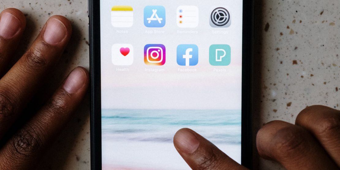
Imagine, for a second, the “apps” screen on your phone. Mine is a dizzying array of colorful icons arranged in accordance to my own weird headspace (My daughter meanwhile arranged hers beautifully by color). Looking at my apps is like looking at my brain. I know where what I want is and I go to it unerringly.
The most recognizable aspect of any app icon is probably color, followed by strong figure-ground relationship. App icons themselves are all the same shape so that has no bearing on how we pick out the ones we want. Placement probably (no, for sure!) has a bearing on this as well. Certainly when I’ve accidentally moved apps around, I can’t find things and move them back as soon as possible.
The Science of App Icons
People have even done scientific studies on this! Check out this example: “App icon similarity and its impact on visual search efficiency on mobile touch devices” by Anna K. Trapp and Carolin Wienrich. Or this one: “An icon that everyone wants to click: How perceived aesthetic qualities predict app icon successfulness” from Henrietta Jylhä and Juho Hamariab, which comes to the conclusion that your app will be more commercially successful if its icon is pretty and conveys the elusive quality of, well… quality.
App icon = packaging crossed with the semiotic nature of street signs. We all know the value of both of those things! It’s as though one certain highway exit sign tells you whether heading down that path is a good idea or not, or if a street sign expressed our emotional reaction to its corresponding destination. Home! Yes! I love home, I want to go home! Happy blushing emoji!
Certain apps we need and use regularly and we need to find them unerringly. Shazam—the app for finding out “what the song is that in the Modelo commercial?—is one that you have to find quickly. Must find Shazam now before this song stops! If we can’t find an app on our phone we’re not going to repeatedly use it, and therefore will not develop an attachment to it or its service.
Color, Company Identity and Logo Design
Knowing that an app must be immediately recognizable… we could then argue that an app icon becomes an extremely distilled version of a company logo. Logically, then, simplifying a logo to one color would make for a better app and clearer recognizability.
Coca-Cola is red! Target is red! Home Depot is orange! Boom!
There are obvious exceptions to this. FedEx, for example (and who could forget FedEx’s striking evolution from Federal Express to FedEx, hidden arrow and all) is staunchly identified with purple and orange, while its counterpart UPS calls itself “Brown” even though its logo is gold and brown. Yet either logo would be clearly recognizable with no color at all, because of the strength of the logo’s design. UPS has a shield, and FedEx has its arrow.
I’m not a psych major, and I don’t pretend to entirely fathom the vast quantity of scientific research behind all of this, but it seems intuitively apparent that in a world where we are more and more inundated with information, we seek clearer and clearer ways in which to wade through the enormous amount of unwanted sensory input.
In this quest, simplification may be key to improving our ability to reach and communicate with our desired audiences. In other words, don’t sleep on the value of a simple, well-designed, one-color app icon.